I’ve always loved the Petite Purls home page, but after we made the site a bit wider back 2 issues ago I felt a bit frustrated with the “plain-ness” of the inner pages, and how I could only use horizontal images for the home page. I wanted to have more fun with the site. About a year ago I discovered an fantastic photographer named Jasmine Star, who is just amazingly brilliant. She was in school studying to be a lawyer when the took a 180 degree turn and decided to take up photography, before she even knew how to use a camera. She jumped right in and rocked it hard. She is incredibly intelligent about all things social networking and how to leverage your brand online. I find her to be a total inspiration. Her photography is amazing.
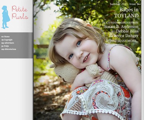
She has a really sweet website and blog, she’s very fashion oriented as she’s in a fashion industry (Wedding Photography).
I was analyzing and thinking a lot about  the Knitting-Pattern-Industry (that is just what I am calling the part I was thinking about) and how we have so many publications, and online publications. I started thinking about the magazine metaphor. There are sites that take the magazine metaphor more deliberately, allowing you to actually turn the page. Loads of sites do this, to some extent even Amazon does. Lots of sites outside our industry do this. I’ve never seen anyone in our industry do something like Jasmine has done (and not often found outside of it), which I found surprising considering how many publications there are. It smacked me in the head and sort of screamed at me in regard to online “publications” in general. Our little magazine will never be printed, but I wanted it to FEEL like it is a true publication.
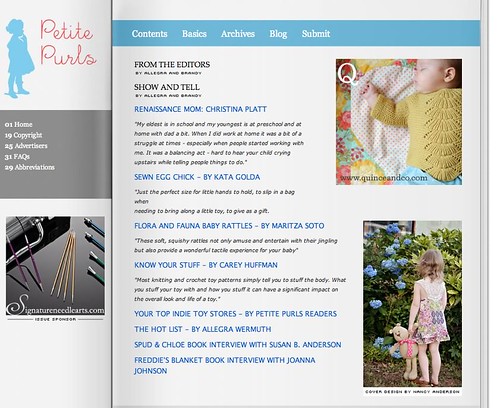
Having an extensive background in website design I started thinking, why aren’t more people using the magazine metaphor in a really excellent and amazing way, unique to each brand. It almost seems overwhelmingly obvious how great and versatile this is. I feel like lots of publication should be doing it, it’s such a neat way to translate from print to web.
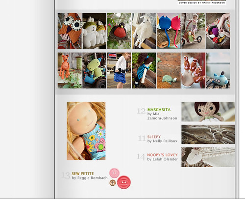
Sometimes with web design we get caught up in HTML and grids and code, and forget about how amazingly fun and creative print layout can be. I started thinking “wow, if I do it this way I can change the pattern index page for EACH issue and have a bit of fun with it, or even do fun and funky layouts for articles, I can take it ALL THE WAY” – from a graphic design perspective, while keeping it 100% in the ultra-usable HTML type interface people like to work in online.
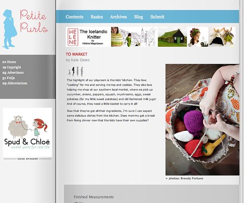
This is how the re-design for Petite Purls was born. I’m a layout and typography geek. Don’t ask me to illustrate an amazing logo, or create some kind of fantastic 3D scene in photoshop. Don’t even ask me to draw something life-like, hand me a blank page and give me a color palette, photos and text to lay-out and I’m your girl (oh yeah, don’t forget the fonts!).
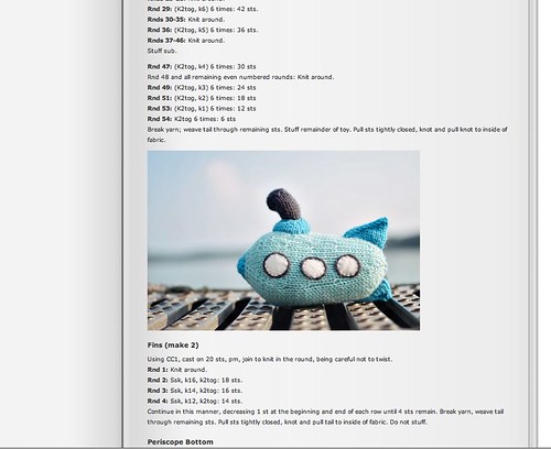
I have a lot more crazy plans for this, and can’t wait to be able to get more creative with my layouts. Thank you Jasmine Star for being so amazing, I hope you are flattered by the imitation, which is why I 100% wanted to put it out there that this is who inspired me. Â I hope I am not the last person to use this wonderful metaphor because I get so scared to think of the beauty of print layout getting completely lost in our digital world. Typography is such an important part of design and sometimes it feels very lost, it’s a testimate to the power of fonts and layout that you can recognize an entire era just by seeing a war poster or magazine cover, and it is suddenly becoming nostalgic just to hold a hard-back book in your hands to read.
Many designers, artists and writers know the thrill of an empty journal or sketching book. There is something fun about going to my graphics program to design the index page for each issue, instead of getting stuck in the doldrums of a set design and template system most every website follows, in which I always go straight to HTML. It was an amazing epiphany for me, and one that doesn’t even have to be translated with a blank book or magazine page used as a back-drop in the more literal interpretation of the concept, but this was where I started (the blank page) and what I wanted to show, that you can translate from print to web, and still leverage the power of basic HTML. That as a web-designer who for years only ever experienced being creative at the very BEGINNING of the process, but never after unless it was a re-design. Here I have a limitless palette (within the constraints of my style guide and brand). I suppose it’s a paradigm shift in my thinking (and maybe one loads of others have had before me and I’m WAY late to the party!).
I feel like I’ve just barely scratched the surface in how much fun I can have with this layout and how it opened up my way of thinking about web-design.
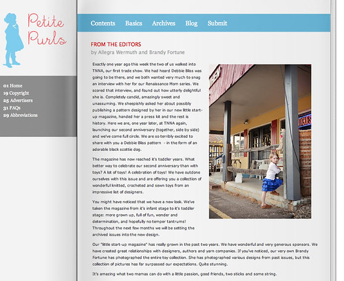
PS. If your getting married and looking for your dream wedding photographer, Jasmine just might be it! Mad props to her for being completely 100% brilliant and for being my inspiration.
PSS. I also did the photography for the entire issue! Sqeeeeeee!
Looking for free pattern from Petitepurls for “little knitted doll”. Can you help me?